OVERVIEW
The U.S. stock market bounced back last week, with the S&P 500 gaining 1.16%, the Dow rising 0.94%, and the Nasdaq jumping 2.06%.
The S&P 600 index of small-cap stocks led the way, gaining 2.12%, while large-cap stocks rose 1.14%. Growth stocks rose 1.7% versus a 1.07% gain for value stocks.
International developed country stocks registered similar returns to the U.S., gaining about 1.16%. But the biggest gains came from emerging market stocks, which rose 2.31% for the week.
Bonds had a good week, as the yield on the 10-year U.S. Treasury note fell to 1.58% from 1.62% the week before (bond prices rise when yields fall). Long-term Treasuries rose 1.1%, investment-grade corporates rose 0.55%, high-yield (junk) bonds gained 0.36%, municipal bonds increased 0.24%, and inflation-protected Treasuries (TIPS) rose around 0.35%.
Real estate continued its strong performance for the year, gaining around 2% last week. Commodities had a similarly strong week, gaining about 2.12%.
The U.S. dollar was mostly flat for the week and is down just slightly for the year.
KEY CONSIDERATIONS
Trend Exhaustion – U.S. stocks have had quite the run since bottoming in March last year. As our recently published Chart of the Week pointed out, this has been the strongest start to a new cyclical bull market in at least the past 50 years. However, a few risks are bubbling to the surface that has recently caught our attention.
For example, the “trend,” or the general direction of stock prices, is starting to show signs of exhaustion. The chart below illustrates what I mean.
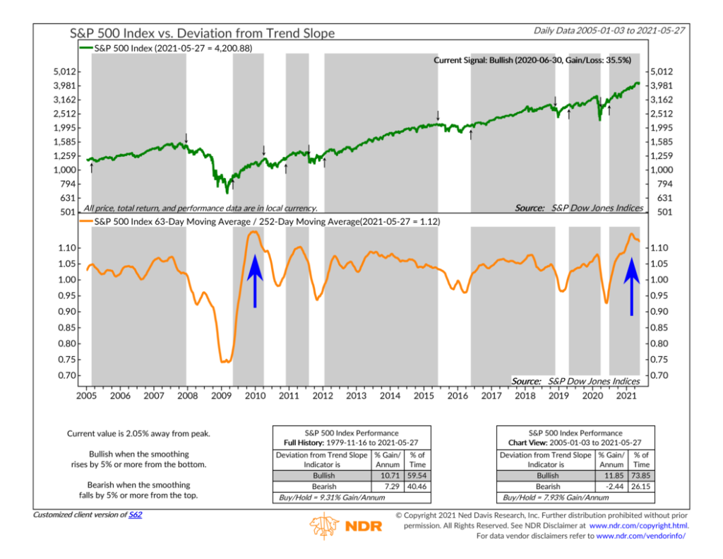
This is what we call a deviation-from-trend indicator. It takes the average price of the S&P 500 stock index over the past three months and divides it by the average price over the past year. When recent prices are accelerating relative to their longer-term average, the ratio (represented by the orange line) goes up. But when things start to cool off, the ratio reverses and begins to fall, a sign that the price action is slowing.
As the blue arrow on the right of the chart shows, this ratio peaked and rolled over a few months ago. Historically, the risks of a sustained downturn are highest when the ratio has fallen 5% or more from a peak. Currently, it’s about 2.05% away from its peak. So, it still has more room to fall before a negative signal is triggered, which is good. However, the trend is moving in the wrong direction, a less encouraging sign.
Interestingly, the last time this ratio reached a level as high as it recently did was coming out of the Financial Crisis of 2008. The S&P 500 rallied strongly for about a year coming off the March 2009 low. As the blue arrow on the left of the chart shows, the deviation-from-trend ratio hit a peak near the beginning of 2010 and then started falling until a negative signal was triggered in April. Over the next seven months, stock returns were essentially flat. Eventually, the indicator gave the all-clear sign, and the rally continued from there.
Whether a similar dynamic plays out this time around remains to be seen. But there is no denying that stock prices have come a long way in a relatively short amount of time. At some point, it wouldn’t be surprising if the market decided to take a step back and catch its breath.
This is intended for informational purposes only and should not be used as the primary basis for an investment decision. Consult an advisor for your personal situation.
Indices mentioned are unmanaged, do not incur fees, and cannot be invested into directly.
Past performance does not guarantee future results.
The post Trend Exhaustion first appeared on NelsonCorp.com.