OVERVIEW
The U.S. stock market surged last week as all three major indices were in the green. The S&P 500 rose 1.83%, the Dow gained 2.02%, and the Nasdaq increased 2.04%.
Foreign stocks were also up, with developed country stocks gaining 0.81% and emerging markets up 1.18%.
Bonds had a good week, too, as the 10-year Treasury rate dropped to 3.7%. Intermediate-term Treasuries increased 0.7%, and long-term Treasuries rose 1.76%. Both investment-grade and high-yield bonds were up a little over 1% for the week.
While real estate had a strong week, up 3.35%, commodities were down by about 0.26%. This was mostly due to the 1% drop in oil prices. Gold, however, rose 0.33%, and corn increased 0.83%. Finally, the U.S. dollar fell slightly by about 0.07% against the world’s major currencies.
KEY CONSIDERATIONS
Big MACD – We’ve talked a lot lately about how momentum is picking up steam in the stock market. And while there is still some selling resistance around the 4200 level on the S&P 500 Index, it does appear that the market is finally beginning to surpass that hurdle.
A popular technical indicator may be one reason why.
The indicator in question is the Moving Average Convergence Divergence (MACD) indicator. The MACD combines momentum and trend following into a single indicator and, as the name implies, is based on convergences and divergences between a long- and short-term moving average—in this case, a 26-week and 12-week moving average, respectively. The difference between the two moving averages is called the MACD line, and then a 9-week smoothing is applied to the MACD line to create a signal line.
How to interpret it? When the MACD line crosses above the signal line, as it recently did, it is considered a bullish signal for the S&P 500 Index. Conversely, a bearish signal occurs when the MACD line crosses below the signal line.
Here’s what the MACD indicator looks like in action. The top clip of the chart below shows the S&P 500 Index. And on the bottom clip, we have the MACD line as the blue line and the orange line as the signal line.
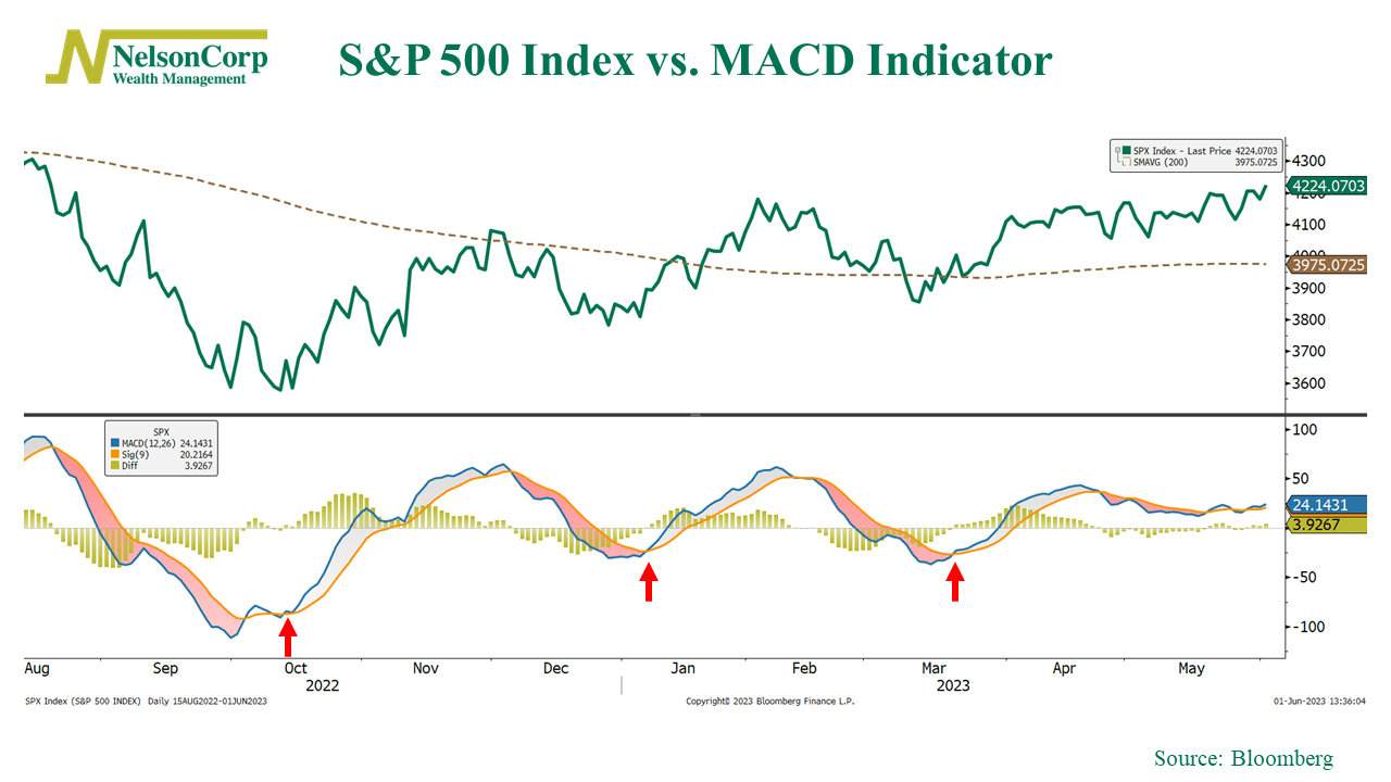
I placed red arrows on the chart showing the past three instances where the MACD indicator triggered a bullish signal for the S&P 500. All three proved to be timely signals as they coincided with rallies off the October, December, and March lows. The fact that we recently got another bullish signal (albeit just barely) is likely a positive sign for stock market momentum going forward—assuming the signal holds.
But why is it bullish? Because according to one study, since 1950, all MACD bullish signals have generated average forward 3-, 6-, and 12-month returns of 2%, 4%, and 8.3%, respectively. Additionally, bullish MACD signals that have occurred when the S&P 500 is above its 200-day moving average—which it is now—have generated higher returns than bullish signals occurring when the index is below its 200-day moving average.
The bottom line? At the end of the day, the MACD indicator is just one indicator. But it is a useful indicator that can help identify both trend direction and momentum. If you can get trend direction and momentum right, you’re already on the right track to better identifying stock market risks. Right now, the MACD indicator is moving sideways with a slightly bullish tilt, which is pretty much in line with the overall weight of the evidence in our models.
This is intended for informational purposes only and should not be used as the primary basis for an investment decision. Consult an advisor for your personal situation.
Indices mentioned are unmanaged, do not incur fees, and cannot be invested into directly.
Past performance does not guarantee future results.
The post Big MACD first appeared on NelsonCorp.com.