OVERVIEW
The U.S. stock market went on a roller coaster ride last week and ended roughly where it started. The VIX index, a measure of expected stock market volatility, remained elevated with a reading above 30.
All that volatility resulted in another week of declines, though. The S&P 500 dropped 0.21%, its fifth straight week of negative returns. The Dow declined 0.24%. And the tech-heavy Nasdaq took another beating and fell 1.54% to end the week. There was one bright spot, however: value stocks posted weekly gains of about 0.6%.
You wouldn’t have found any relief in foreign stocks, though. Developed country stocks fell 2.99%, and emerging markets tumbled 4.15%.
And bonds? Forget about it. The 10-year Treasury note’s yield rose above 3%, resulting in intermediate-term Treasury price declines of 1.32%. Long-term Treasuries got torched and fell around 5.25%. However, short-term Treasuries did notch a gain of 0.03%.
Commodities did decent, rising about 0.66% overall. But this was mostly due to oil, which rose 6.44%. Gold fell 1.43%, and corn declined 3.53%. The U.S. dollar continued to strengthen and gained around 0.5% for the week.
KEY CONSIDERATIONS
This is What a Defensive Market Looks Like – One of the big themes we’ve talked about recently is inflation. In our featured blog posts this week, we highlighted that unit labor costs—or how much a business pays its workers to produce a unit of output—are rising at their fastest pace since 1982 on a year-over-year basis. More so, the 5-year average of those increases has reached levels not seen since the 1980s—a warning that structural inflation is indeed reaching concerning levels.
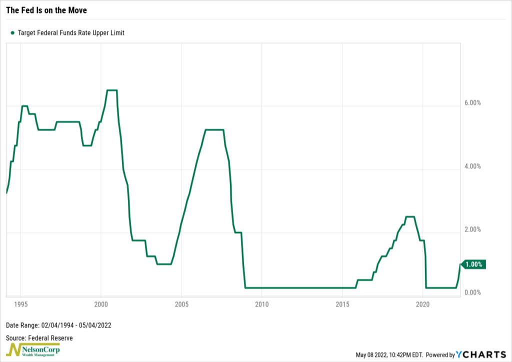
All of that is troublesome for the economy. And as stewards of our nation’s monetary stability, the Federal Reserve has vowed to come to the rescue. In a widely anticipated move, the Fed raised short-term interest rates on Wednesday by 50 basis points to a range of 0.75% to 1.00% (shown on the chart below). This was the largest increase in the Fed Funds rate in a single announcement since May 2000.
Simmering hot inflation. Upward moving rates. A hawkish Fed. All this is very different from what we’ve become accustomed to in recent history. And taken together, it’s a recipe for a defensive market.
Here’s what I mean. The chart below shows the spread between the MSCI USA Cyclical Sectors index and the MSCI USA Defensive Sectors Index. As I’ve pointed out on the chart, the line has rolled over dramatically this year, meaning stocks in defensive sectors have been outperforming stocks in cyclical sectors by a wide margin.
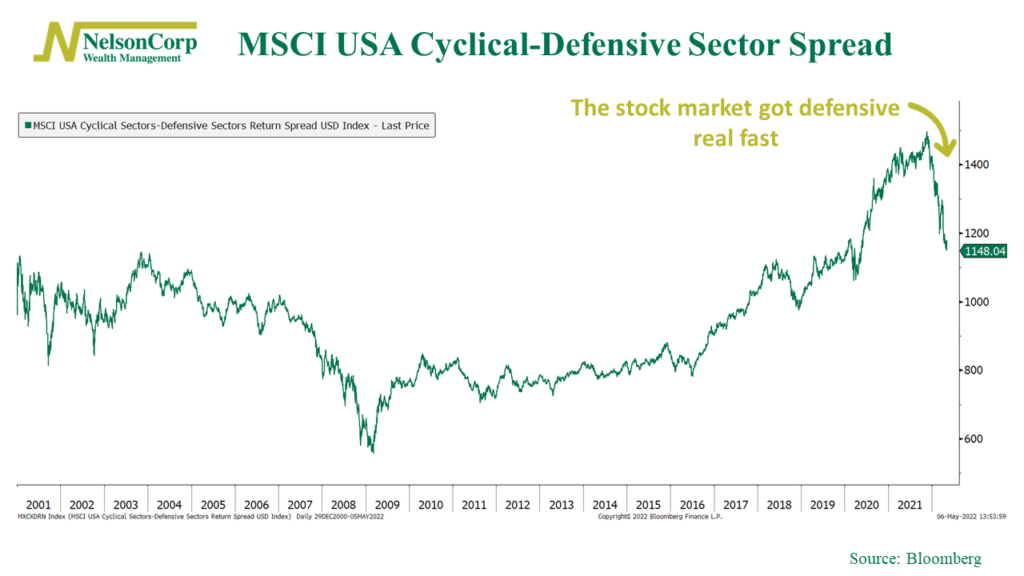
This is what a defensive market looks like. And historically, when these defensive sectors—like consumer staples, health care, utilities, and telecommunications—are doing relatively better than the more cyclical, economically sensitive stock market sectors, it’s generally been during times when the overall market and/or economy is struggling.
In other words, there are times in the market cycle when the environment is a good one for overweighting stocks in your portfolio. But unfortunately, now is likely not one of those times.
This is intended for informational purposes only and should not be used as the primary basis for an investment decision. Consult an advisor for your personal situation.
Indices mentioned are unmanaged, do not incur fees, and cannot be invested into directly.
Past performance does not guarantee future results.
The post This is What a Defensive Market Looks Like first appeared on NelsonCorp.com.