OVERVIEW
U.S. stocks had a pretty lousy time on a holiday-shortened week. The S&P 500 dropped 2.1%, and the Nasdaq Composite fell 2.6%. The Dow Jones Industrial Average was the relative winner, slipping just 0.8%.
Small-cap stocks had a positive week, however, gaining about 0.9%. Mid-cap stocks also rose about 0.44%.
International stocks slipped, with the MSCI EAFE index of developed country stocks losing 1.1% and the MSCI EM index of emerging market stocks dropping 1.33%.
The rout in bonds continued as the yield on the 10-year Treasury note rose to 2.83% from 2.66% the previous week. Long-term Treasuries got crushed, falling about 3% for the week. Investment-grade corporate bonds fell 1.27%, while high-yield (junk) bonds held up better, declining around 0.3%. Municipal bonds fell 0.7%, and TIPS dropped 0.4%.
The most significant gains came from commodities, which rose around 4.8% overall. Gold rose 1.5%, corn gained 2.4%, and oil surged roughly 7.4%. The U.S. dollar also strengthened by 0.6% for the week. Real estate, however, declined nearly 1%.
KEY CONSIDERATIONS
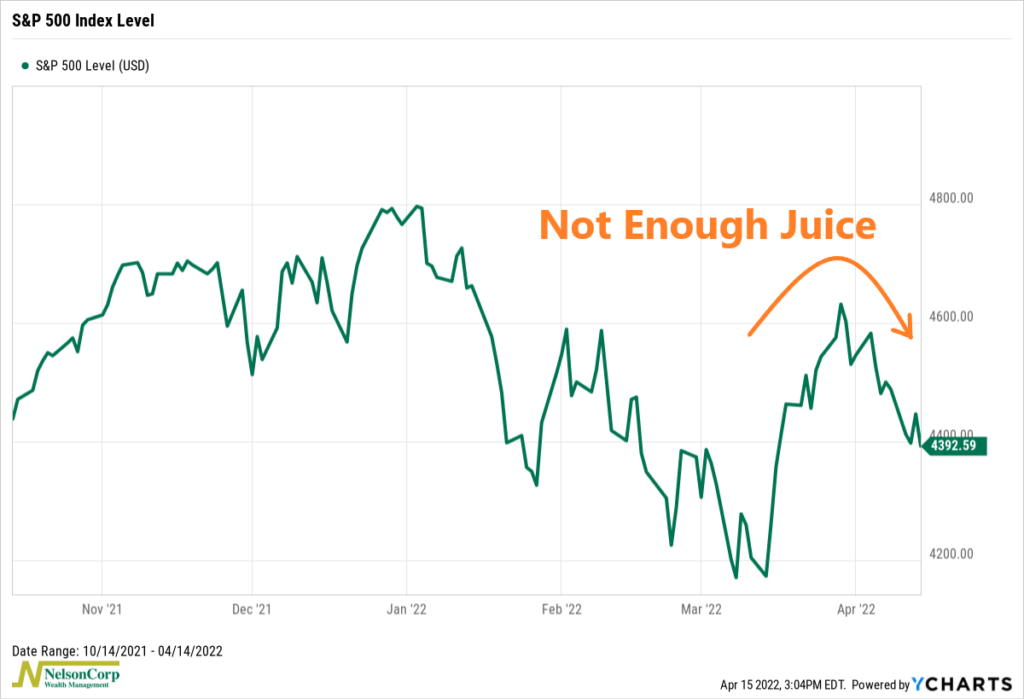
More Participation, Please! – For a few weeks there, it looked as if the stock market was trying to stage a comeback after the rough start to the year. A nearly 11% rally from the March lows almost did it for the S&P 500 index.
But alas, the rally ran out of juice. The market rolled back over near the end of March and has fallen around 5% since then.
So, what happened?
Well, again, there have been a few instances in the past few months where investors have tried to scramble in and buy the dip, but there just hasn’t been enough gas in the tank to make it sustainable.
For example, the chart below shows the 10-day average volume flowing into advancing stocks divided by the 10-day average volume flowing into declining stocks for the NASDAQ Composite. We call this a volume thrust indicator. Massive spikes to the upside signal buying opportunities, whereas large downward spikes indicate poor market conditions.
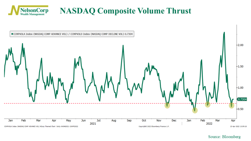
As you can see, there have been several large thrusts to the downside this year, reaching levels lower than we saw all last year. This has kept the overall market subdued. Even the significant upside thrust near the end of March was quickly reversed as volume flowed back into declining NASDAQ stocks with incredible speed.
A simple lack of participation is another reason the market hasn’t been able to sustain much of a rally this year.
Why? Because the stock market is comprised of stocks, and when more of those stocks are participating in a rally, it’s a sign of a healthier market. In other words, a market that moves together stays together.
But here’s a chart of our Participation Composite, which combines the six most important indicators that we track for stock market participation.
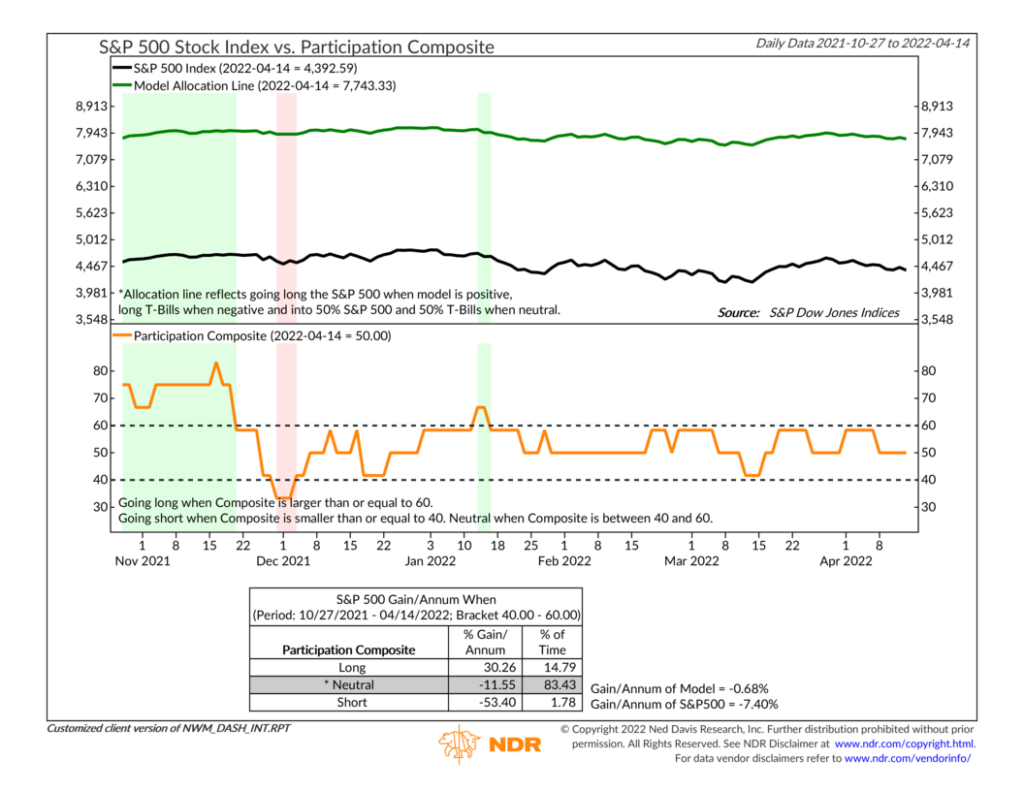
For the most part, it’s been mainly in a neutral zone all year (orange line, bottom clip). Other than that brief blip in January, the last time these indicators were signaling a lot of market participation was way back in November of last year.
To follow up on that, here’s an example of one of the participation indicators included in the composite. The chart below shows the percentage of stocks trading at new 52-week lows on the New York Stock Exchange (NYSE). The higher this number, the less the market’s constituents are participating in a rally.
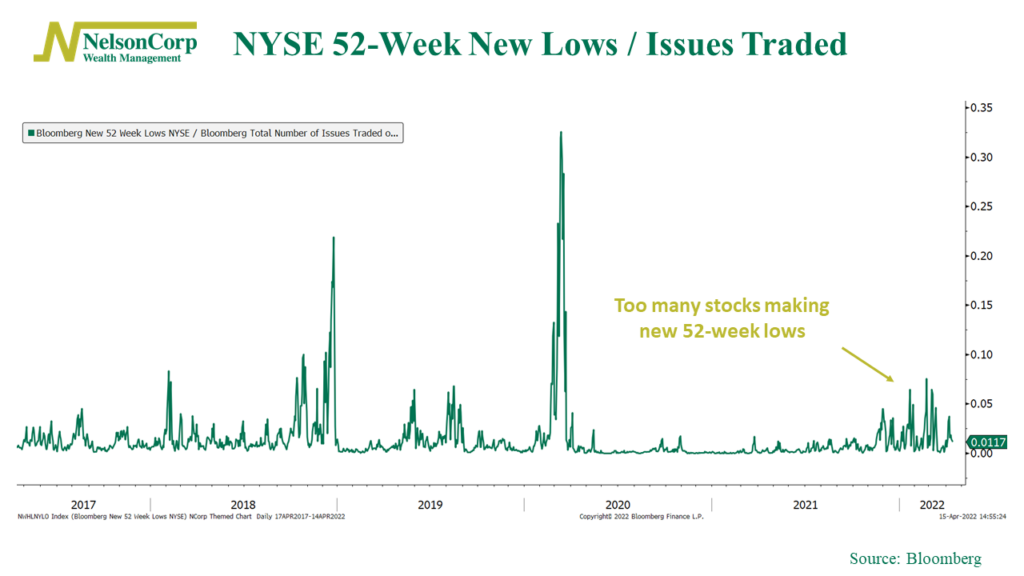
As you can see, the spikes in new lows haven’t been as large as the selloffs in 2018 and 2020, but they have lasted longer. It’s not a good sign when the market goes through a sustained period with a lot of stocks hitting fresh 52-week lows. We would like to see this cluster of new lows fade away before we can get more confident that the market is ready to rally to new heights.
Lastly, I’ll end with one more chart that I think pretty much sums up the state of participation in the stock market. This chart shows the percentage of stocks in the S&P 500 index trading above their average 200-day price.
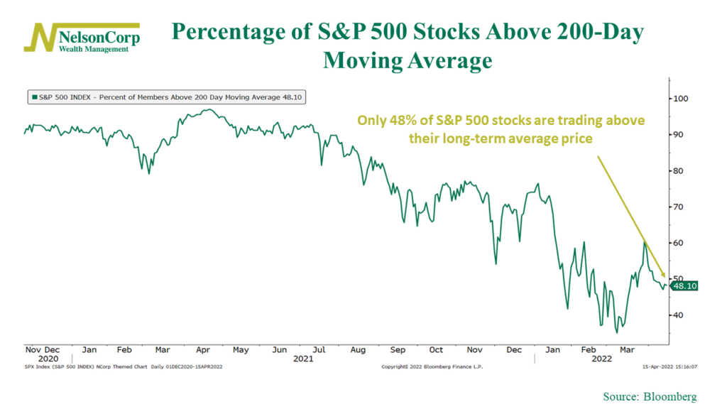
This one has been falling somewhat steadily for roughly a year now. Basically, breadth has been getting worse and worse. And a market with bad breadth has the potential to be quite volatile, something we’ve certainly witnessed of late. So, a reversal in this trend would go a long way toward improving the technical health of the stock market. This is a good chart to watch going forward.
This is intended for informational purposes only and should not be used as the primary basis for an investment decision. Consult an advisor for your personal situation.
Indices mentioned are unmanaged, do not incur fees, and cannot be invested into directly.
Past performance does not guarantee future results.
The post More Participation, Please! first appeared on NelsonCorp.com.